UX/UI
When I had to play the UX/UI Designer role in the early days of Redbird - which is definitely not my job - I was lucky enough to have led an innovation initiative at Accenture. That opportunity conducted me to define the innovation offering for the Accenture Resource group for the Paris office. In that process, I have been trained to design thinking, lean startup, innovation keys with, between others, Strate School of Design a prestigious design school. This training was helpful enough to help me lead some innovation workshops for Accenture. A rewarding experience.
My favorite set of tools to iterate and share ideas quickly are by far: markers, post-its, a pencil, blank sheets of paper and tracing paper. As bright as Humankind is we haven’t invented something more natural than that (this reminds me of the legend that NASA spent millions on developing a pen that would write in space - with no gravity -, whereas the Soviet cosmonauts used a pencil. I love that story even if history tells us it doesn’t really go that way).
But a sheet of paper with nice drawings isn’t sufficient: developers need redlines to be efficient, and paper cannot be widely spread, nor it can enable offline collaboration.
Assuring the UX/UI Designer role among all others hats, I had to wear at that time (Product Manager, Product Owner, Director of Engineering, etc.) forced me to find the best tools to produce the necessary documents for my developers’ team.
The best combo I found after so many tries is: Sketch + Zeplin.
The Sketch application is by far the most intuitive tool I ever used enabling me to be way more efficient than with Illustrator - for which you definitely need dedicated training.
Then entered adobe XD which is a serious contender in my heart, but still hasn’t bit my favorite. Will certainly give it other tries in the future.
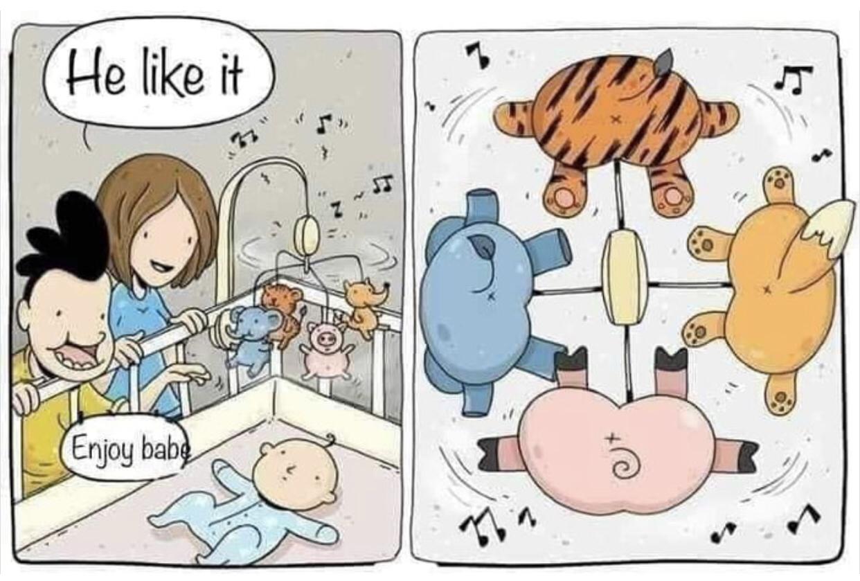
Whatever you are about to do, whatever your tools will be, you should always keep in mind how your end users will use your product!

I found this image here
Bridging the gap between UX/UI designers and developers
It is crucial that everyone in your team speaks the same languages. In particular, in Software development, starting on the smallest component of an application button may not mean the same thing among people. You may build a button in a thousand different ways. This can lead to situations where your application may look fuzzy worst; you will develop again and again the same component duplicating code.
Facebook has built a development environment for UI components: storybook. This kind of solution will lead you to build and share a common visual language on which you’ll be able to iterate and extend your application.
Some paying services also exist, ex: bitsrc.io.
Resources
- DiceBear is an avatar library for designers and developers.
- Fontawesome
- Material icons
- nerd-fonts - One repository to rule them all. It includes severals such as fontawesome.
- Open Peeps - Offers a collection of hand-drawn illustration library of people.
- The noun project - An unlimited source of icons for everything.
Sketch application
- Charts - A impressive collection of charts for sketch
Further UX/UI inspiration
- awesome-design-tools - The place to go if you want to find a particular tool for a particular activity.
- Mickadoule’s TikTok Channel - A great source of discovery about design through Figma and other tools.
- Paintcode - Converting your sketch designs in code.
- Sketch 43 is coming to town with a new game. An open file format! - Using open source file format to strength your position enabling really strong automation and becoming the hub for the design process.
- The ultimate guide to proper use of animation in UX - The place to go if you are asking yourself animation questions for your mobile or web application.
- Visual evolution of Algorithmia platform - Interesting tour of the Algorithmia platform, from 2015 to 2019.